# HIDDEN
# Clear previously defined variables
%reset -f

# Set directory for data loading to work properly
import os
os.chdir(os.path.expanduser('~/notebooks/06'))
# HIDDEN
import warnings
# Ignore numpy dtype warnings. These warnings are caused by an interaction
# between numpy and Cython and can be safely ignored.
# Reference: https://stackoverflow.com/a/40846742
warnings.filterwarnings("ignore", message="numpy.dtype size changed")
warnings.filterwarnings("ignore", message="numpy.ufunc size changed")

import numpy as np
import matplotlib.pyplot as plt
import pandas as pd
import seaborn as sns
%matplotlib inline
import ipywidgets as widgets
from ipywidgets import interact, interactive, fixed, interact_manual
import nbinteract as nbi

sns.set()
sns.set_context('talk')
np.set_printoptions(threshold=20, precision=2, suppress=True)
pd.options.display.max_rows = 7
pd.options.display.max_columns = 8
pd.set_option('precision', 2)
# This option stops scientific notation for pandas
# pd.set_option('display.float_format', '{:.2f}'.format)
# HIDDEN
def df_interact(df):
    '''
    Outputs sliders that show rows and columns of df
    '''
    def peek(row=0, col=0):
        return df.iloc[row:row + 5, col:col + 8]
    interact(peek, row=(0, len(df), 5), col=(0, len(df.columns) - 6))
    print('({} rows, {} columns) total'.format(df.shape[0], df.shape[1]))
Visualizing Qualitative Data
For qualitative or categorical data, we most often use bar charts and dot charts. We will show how to create these plots using seaborn and the Titanic survivors dataset.
# Import seaborn and apply its plotting styles
import seaborn as sns
sns.set()

# Load the dataset
ti = sns.load_dataset('titanic').reset_index(drop=True)

# This table is too large to fit onto a page so we'll output sliders to
# pan through different sections.
df_interact(ti)
Bar Charts
In seaborn, there are two types of bar charts. The first type uses the countplot method to count up the number of times each category appears in a column.
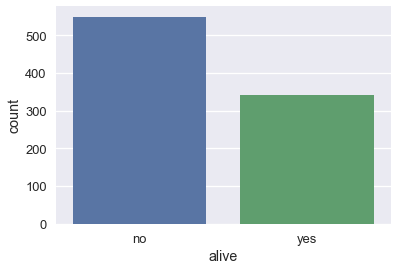
# Counts how many passengers survived and didn't survive and
# draws bars with corresponding heights
sns.countplot(x='alive', data=ti);
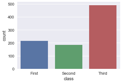
sns.countplot(x='class', data=ti);
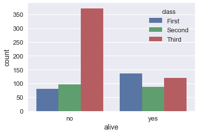
# As with box plots, we can break down each category further using color
sns.countplot(x='alive', hue='class', data=ti);
The barplot method, on the other hand, groups the DataFrame by a categorical column and plots the height of the bars according to the average of a numerical column within each group.
# For each set of alive/not alive passengers, compute and plot the average age.
sns.barplot(x='alive', y='age', data=ti);
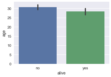
The height of each bar can be computed by grouping the original DataFrame and averaging the age column:
ti[['alive', 'age']].groupby('alive').mean()
By default, the barplot method will also compute a bootstrap 95% confidence interval for each averaged value, marked as the black lines in the bar chart above. The confidence intervals show that if the dataset contained a random sample of Titanic passengers, the difference between passenger age for those that survived and those that didn't is not statistically significant at the 5% significance level.
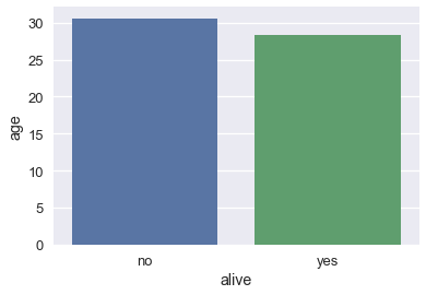
These confidence intervals take long to generate when we have larger datasets so it is sometimes useful to turn them off:
sns.barplot(x='alive', y='age', data=ti, ci=False);
Dot Charts
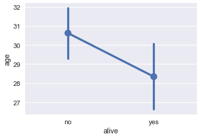
Dot charts are similar to bar charts. Instead of plotting bars, dot charts mark a single point at the end of where a bar would go. We use the pointplot method to make dot charts in seaborn. Like the barplot method, the pointplot method also automatically groups the DataFrame and computes the average of a separate numerical variable, marking 95% confidence intervals as vertical lines centered on each point.
# For each set of alive/not alive passengers, compute and plot the average age.
sns.pointplot(x='alive', y='age', data=ti);
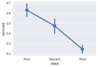
Dot charts are most useful when comparing changes across categories:
# Shows the proportion of survivors for each passenger class
sns.pointplot(x='class', y='survived', data=ti);
# Shows the proportion of survivors for each passenger class,
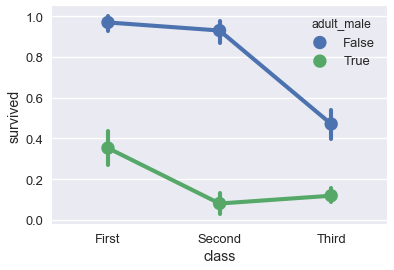
# split by whether the passenger was an adult male
sns.pointplot(x='class', y='survived', hue='adult_male', data=ti);