# HIDDEN
# Clear previously defined variables
%reset -f

# Set directory for data loading to work properly
import os
os.chdir(os.path.expanduser('~/notebooks/06'))
# HIDDEN
import warnings
# Ignore numpy dtype warnings. These warnings are caused by an interaction
# between numpy and Cython and can be safely ignored.
# Reference: https://stackoverflow.com/a/40846742
warnings.filterwarnings("ignore", message="numpy.dtype size changed")
warnings.filterwarnings("ignore", message="numpy.ufunc size changed")

import numpy as np
import matplotlib.pyplot as plt
import pandas as pd
import seaborn as sns
%matplotlib inline
import ipywidgets as widgets
from ipywidgets import interact, interactive, fixed, interact_manual
import nbinteract as nbi

sns.set()
sns.set_context('talk')
np.set_printoptions(threshold=20, precision=2, suppress=True)
pd.options.display.max_rows = 7
pd.options.display.max_columns = 8
pd.set_option('precision', 2)
# This option stops scientific notation for pandas
# pd.set_option('display.float_format', '{:.2f}'.format)
# HIDDEN
def df_interact(df):
    '''
    Outputs sliders that show rows and columns of df
    '''
    def peek(row=0, col=0):
        return df.iloc[row:row + 5, col:col + 8]
    interact(peek, row=(0, len(df), 5), col=(0, len(df.columns) - 6))
    print('({} rows, {} columns) total'.format(df.shape[0], df.shape[1]))
Customizing Plots using matplotlib
Although seaborn allows us to quickly create many types of plots, it does not give us fine-grained control over the chart. For example, we cannot use seaborn to modify a plot's title, change x or y-axis labels, or add annotations to a plot. Instead, we must use the matplotlib library that seaborn is based off of.
matplotlib provides basic building blocks for creating plots in Python. Although it gives great control, it is also more verbose—recreating the seaborn plots from the previous sections in matplotlib would take many lines of code. In fact, we can think of seaborn as a set of useful shortcuts to create matplotlib plots. Although we prefer to prototype plots in seaborn, in order to customize plots for publication we will need to learn basic pieces of matplotlib.
Before we look at our first simple example, we must activate matplotlib support in the notebook:
# This line allows matplotlib plots to appear as images in the notebook
# instead of in a separate window.
%matplotlib inline

# plt is a commonly used shortcut for matplotlib
import matplotlib.pyplot as plt
Customizing Figures and Axes
In order to create a plot in matplotlib, we create a figure, then add an axes to the figure. In matplotlib, an axes is a single chart, and figures can contain multiple axes in a tablular layout. An axes contains marks, the lines or patches drawn on the plot.
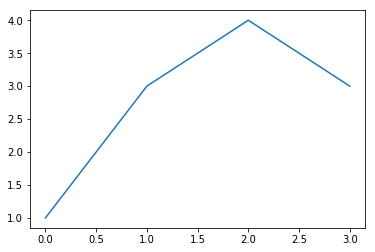
# Create a figure
f = plt.figure()

# Add an axes to the figure. The second and third arguments create a table
# with 1 row and 1 column. The first argument places the axes in the first
# cell of the table.
ax = f.add_subplot(1, 1, 1)

# Create a line plot on the axes
ax.plot([0, 1, 2, 3], [1, 3, 4, 3])

# Show the plot. This will automatically get called in a Jupyter notebook
# so we'll omit it in future cells
plt.show()
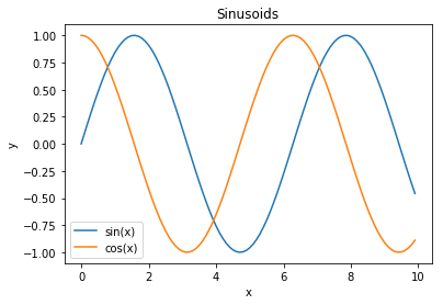
To customize the plot, we can use other methods on the axes object:
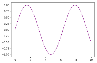
f = plt.figure()
ax = f.add_subplot(1, 1, 1)

x = np.arange(0, 10, 0.1)

# Setting the label kwarg lets us generate a legend
ax.plot(x, np.sin(x), label='sin(x)')
ax.plot(x, np.cos(x), label='cos(x)')
ax.legend()

ax.set_title('Sinusoids')
ax.set_xlabel('x')
ax.set_ylabel('y');
As a shortcut, matplotlib has plotting methods on the plt module itself that will automatically initialize a figure and axes.
# Shorthand to create figure and axes and call ax.plot
plt.plot(x, np.sin(x))

# When plt methods are called multiple times in the same cell, the
# existing figure and axes are reused.
plt.scatter(x, np.cos(x));
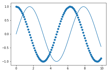
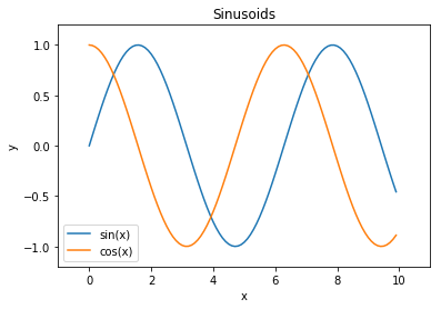
The plt module has analogous methods to an axes, so we can recreate one of the plots above using plt shorthands.
x = np.arange(0, 10, 0.1)

plt.plot(x, np.sin(x), label='sin(x)')
plt.plot(x, np.cos(x), label='cos(x)')
plt.legend()

# Shorthand for ax.set_title
plt.title('Sinusoids')
plt.xlabel('x')
plt.ylabel('y')

# Set the x and y-axis limits
plt.xlim(-1, 11)
plt.ylim(-1.2, 1.2);
Customizing Marks
To change properties of the plot marks themselves (e.g. the lines in the plot above), we can pass additional arguments into plt.plot.
plt.plot(x, np.sin(x), linestyle='--', color='purple');
Checking the matplotlib documentation is the easiest way to figure out which arguments are available for each method. Another way is to store the returned line object:
In [1]: line, = plot([1,2,3])
These line objects have a lot of properties you can control, here's the full list using tab-completion in IPython:
In [2]: line.set
line.set                     line.set_drawstyle           line.set_mec
line.set_aa                  line.set_figure              line.set_mew
line.set_agg_filter          line.set_fillstyle           line.set_mfc
line.set_alpha               line.set_gid                 line.set_mfcalt
line.set_animated            line.set_label               line.set_ms
line.set_antialiased         line.set_linestyle           line.set_picker
line.set_axes                line.set_linewidth           line.set_pickradius
line.set_c                   line.set_lod                 line.set_rasterized
line.set_clip_box            line.set_ls                  line.set_snap
line.set_clip_on             line.set_lw                  line.set_solid_capstyle
line.set_clip_path           line.set_marker              line.set_solid_joinstyle
line.set_color               line.set_markeredgecolor     line.set_transform
line.set_contains            line.set_markeredgewidth     line.set_url
line.set_dash_capstyle       line.set_markerfacecolor     line.set_visible
line.set_dashes              line.set_markerfacecoloralt  line.set_xdata
line.set_dash_joinstyle      line.set_markersize          line.set_ydata
line.set_data                line.set_markevery           line.set_zorder
But the setp call (short for set property) can be very useful, especially
while working interactively because it contains introspection support, so you
can learn about the valid calls as you work:
In [7]: line, = plot([1,2,3])

In [8]: setp(line, 'linestyle')
  linestyle: [ ``'-'`` | ``'--'`` | ``'-.'`` | ``':'`` | ``'None'`` | ``' '`` | ``''`` ]         and any drawstyle in combination with a linestyle, e.g. ``'steps--'``.

In [9]: setp(line)
  agg_filter: unknown
  alpha: float (0.0 transparent through 1.0 opaque)
  animated: [True | False]
  antialiased or aa: [True | False]
  ...
  ... much more output omitted
  ...
In the first form, it shows you the valid values for the 'linestyle' property, and in the second it shows you all the acceptable properties you can set on the line object. This makes it easy to discover how to customize your figures to get the visual results you need.
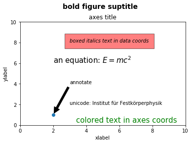
Aribitrary text and LaTeX support
In matplotlib, text can be added either relative to an individual axis object or to the whole figure.
These commands add text to the Axes:
set_title()- add a titleset_xlabel()- add an axis label to the x-axisset_ylabel()- add an axis label to the y-axistext()- add text at an arbitrary locationannotate()- add an annotation, with optional arrow
And these act on the whole figure:
figtext()- add text at an arbitrary locationsuptitle()- add a title
And any text field can contain LaTeX expressions for mathematics, as long as
they are enclosed in $ signs.
This example illustrates all of them:
fig = plt.figure()
fig.suptitle('bold figure suptitle', fontsize=14, fontweight='bold')

ax = fig.add_subplot(1, 1, 1)
fig.subplots_adjust(top=0.85)
ax.set_title('axes title')

ax.set_xlabel('xlabel')
ax.set_ylabel('ylabel')

ax.text(3, 8, 'boxed italics text in data coords', style='italic',
        bbox={'facecolor':'red', 'alpha':0.5, 'pad':10})

ax.text(2, 6, 'an equation: $E=mc^2$', fontsize=15)

ax.text(3, 2, 'unicode: Institut für Festkörperphysik')

ax.text(0.95, 0.01, 'colored text in axes coords',
        verticalalignment='bottom', horizontalalignment='right',
        transform=ax.transAxes,
        color='green', fontsize=15)


ax.plot([2], [1], 'o')
ax.annotate('annotate', xy=(2, 1), xytext=(3, 4),
            arrowprops=dict(facecolor='black', shrink=0.05))

ax.axis([0, 10, 0, 10]);
Customizing a seaborn plot using matplotlib
Now that we've seen how to use matplotlib to customize a plot, we can use the same methods to customize seaborn plots since seaborn creates plots using matplotlib behind-the-scenes.
# Load seaborn
import seaborn as sns
sns.set()
sns.set_context('talk')

# Load dataset
ti = sns.load_dataset('titanic').dropna().reset_index(drop=True)
ti.head()
We'll start with this plot:
sns.lmplot(x='age', y='fare', hue='who', data=ti, fit_reg=False);
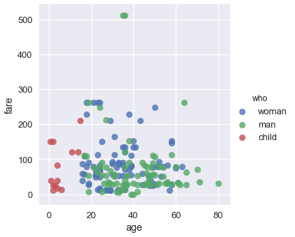
We can see that the plot needs a title and better labels for the x and y-axes. In addition, the two people with the most expensive fares survived, so we can annotate them on our plot.
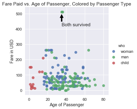
sns.lmplot(x='age', y='fare', hue='who', data=ti, fit_reg=False)

plt.title('Fare Paid vs. Age of Passenger, Colored by Passenger Type')
plt.xlabel('Age of Passenger')
plt.ylabel('Fare in USD')

plt.annotate('Both survived', xy=(35, 500), xytext=(35, 420),
             arrowprops=dict(facecolor='black', shrink=0.05));
In practice, we use seaborn to quickly explore the data and then turn to matplotlib for fine-tuning once we decide on the plots to use in a paper or presentation.