# HIDDEN
# Clear previously defined variables
%reset -f

# Set directory for data loading to work properly
import os
os.chdir(os.path.expanduser('~/notebooks/02'))
# HIDDEN
import warnings
# Ignore numpy dtype warnings. These warnings are caused by an interaction
# between numpy and Cython and can be safely ignored.
# Reference: https://stackoverflow.com/a/40846742
warnings.filterwarnings("ignore", message="numpy.dtype size changed")
warnings.filterwarnings("ignore", message="numpy.ufunc size changed")

import numpy as np
import matplotlib.pyplot as plt
import pandas as pd
import seaborn as sns
%matplotlib inline
import ipywidgets as widgets
from ipywidgets import interact, interactive, fixed, interact_manual
import nbinteract as nbi

sns.set()
sns.set_context('talk')
np.set_printoptions(threshold=20, precision=2, suppress=True)
pd.options.display.max_rows = 7
pd.options.display.max_columns = 8
pd.set_option('precision', 2)
# This option stops scientific notation for pandas
# pd.set_option('display.float_format', '{:.2f}'.format)
SRS vs. "Big Data"
As we have previously mentioned, it is tempting to do away with our long-winded bias concerns by using huge amounts of data. It is true that collecting a census will by definition produce unbiased estimations. Perhaps bias will no longer be a problem if we simply collect many data points.
Suppose we are pollsters in 2012 trying to predict the popular vote of the US presidential election, where Barack Obama ran against Mitt Romney. Since today we know the exact outcome of the popular vote, we can compare the predictions of a SRS to the predictions of a large non-random dataset, often called administrative datasets since they are often collected as part of some administrative work.
We will compare a SRS of size 400 to a non-random sample of size 60,000,000. Our non-random sample is nearly 150,000 times larger than our SRS! Since there were about 120,000,000 voters in 2012, we can think of our non-random sample as a survey where half of all voters in the US responded (no actual poll has ever surveyed more than 10,000,000 voters).
# HIDDEN
total = 129085410
obama_true_count = 65915795
romney_true_count = 60933504
obama_true = obama_true_count / total
romney_true = romney_true_count / total

# 1 percent off
obama_big = obama_true - 0.01
romney_big = romney_true + 0.01
Here's a plot comparing the proportions of the non-random sample to the true proportions. The bars labeled truth show the true proportions of votes that each candidate received. The bars labeled big show the proportions from our dataset of 60,000,000 voters.
# HIDDEN
pd.DataFrame({
    'truth': [obama_true, romney_true],
    'big': [obama_big, romney_big],
}, index=['Obama', 'Romney'], columns=['truth', 'big']).plot.bar()
plt.title('Truth compared to a big non-random dataset')
plt.xlabel('Candidate')
plt.ylabel('Proportion of popular vote')
plt.ylim(0, 0.75);
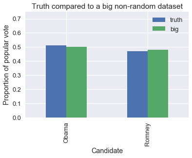
We can see that our large dataset is just slightly biased towards the Republican candidate, just as the Gallup Poll was in 1948. To see this effects of this bias, we simulate taking simple random samples of size 400 from the population and large non-random samples of size 60,000,000. We compute the proportion of votes for Obama in each sample and plot the distribution of proportions.
srs_size = 400
big_size = 60000000
replications = 10000

def resample(size, prop, replications):
    return np.random.binomial(n=size, p=prop, size=replications) / size

srs_simulations = resample(srs_size, obama_true, replications)
big_simulations = resample(big_size, obama_big, replications)
Now, we plot the simulation results and overlay a red line indicating the true proportion of voters that voted for Obama.
bins = bins=np.arange(0.47, 0.55, 0.005)
plt.hist(srs_simulations, bins=bins, alpha=0.7, normed=True, label='srs')
plt.hist(big_simulations, bins=bins, alpha=0.7, normed=True, label='big')

plt.title('Proportion of Obama Voters for SRS and Big Data')
plt.xlabel('Proportion')
plt.ylabel('Percent per unit')
plt.xlim(0.47, 0.55)
plt.ylim(0, 50)
plt.axvline(x=obama_true, color='r', label='truth')
plt.legend();
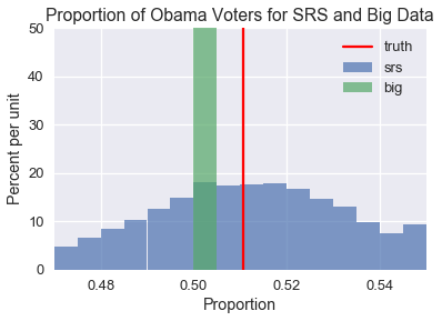
As you can see, the SRS distribution is spread out but centered around the true population proportion of Obama voters. The distribution created by the large non-random sample, on the other hand, is very narrow but not a single simulated sample produces the true population proportion. If we attempt to create confidence intervals using the non-random sample, none of them will contain the true population proportion. To make matters worse, the confidence interval will be extremely narrow because the sample is so large. We will be very sure of an ultimately incorrect estimation.
In fact, when our sampling method is biased our estimations will often first become worse as we collect more data since we will be more certain about an incorrect result. In order to make accurate estimations using an even slightly biased sampling method, the sample must be nearly as large as the population itself, a typically impractical requirement. The quality of the data matters much more than its size.
Takeaways
Before accepting the results of a data analysis, it pays to carefully inspect the quality of the data. In particular, we must ask the following questions:
- Is the data a census (does it include the entire population of interest)? If so, we can just compute properties of the population directly without having to use inference.
- If the data is a sample, how was the sample collected? To properly conduct inference, the sample should have been collected according to a completely described probability sampling method.
- What changes were made to the data before producing results? Do any of these changes affect the quality of the data?
For the curious reader interested in a deeper comparison between random and large non-random samples, we suggest watching this lecture by the statistician Xiao-Li Meng.