Visualization with Matplotlib and Pandas
11 Feb 2019
We created a jupyter notebook gist to demonstrate visual attractive data plots.
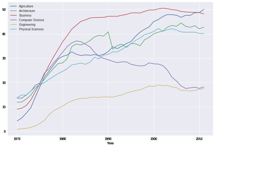
We’ve started with generating a graph with matplotlib’s default style. We then brought that graph to “FTE-level” through a series of steps:
- We used matplotlib’s in-built fivethirtyeight style.
- We added a title and a subtitle, and customized each.
- We added a signature bar.
- We removed the default legend, and added colored labels.
- We removed the default legend, and added colored labels. We made a series of other small adjustments: customizing the tick labels, bolding the horizontal line at y = 0, adding a vertical grid line near the tick labels, removing the label of the x-axis, and increasing the lateral margins of the y-axis.
comments powered by Disqus